Miscellaneous Design Projects
Brand identity
Placemaker Group
As part of the creative team at Becoming Design Office, I developed this dynamic brand for Placemaker Property Development with community development in mind. The Placemaker brand’s geometric shapes are inspired by the property lines of what exists and what’s to come, and they’re a visually engaging element to bring forward colour and playfulness while balancing the more serious business side.


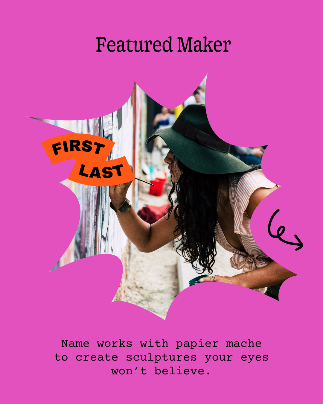
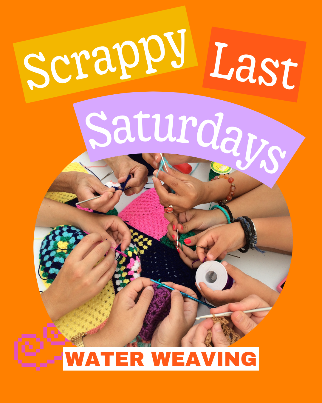
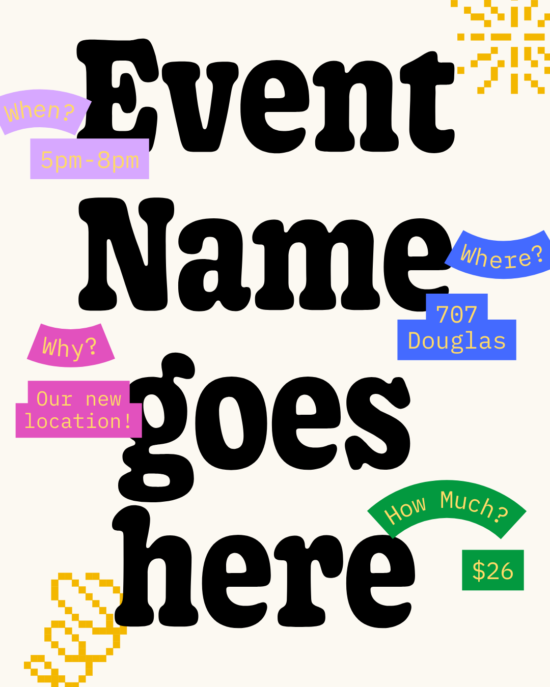
social graphics
Supply Victoria
Supply Victoria is a creative reuse store, diverting art & craft materials from the landfill. The founder Ashley approached me to create a series of editable social graphics based on their established brand to coincide with the launch of their new location.


victoria’s tourism map
Attractions Victoria
This was a 6-month long collaborative effort between myself and the Tourism Victoria’s board of directors, who wanted to update their map. Printed on 100% post-consumer stock, we changed the game with this map by putting usability and accessibility at the forefront.
The resulting map is designed to minimize distractions and provides tourists with a sampling of the character of Victoria, while keeping things easily navigable and functional.
social graphics
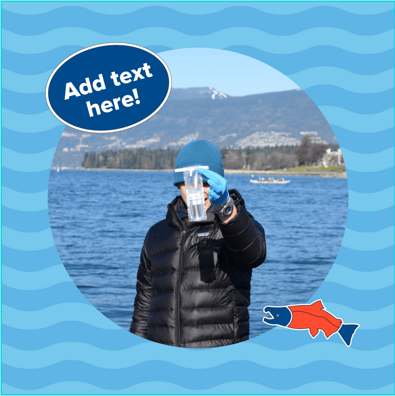
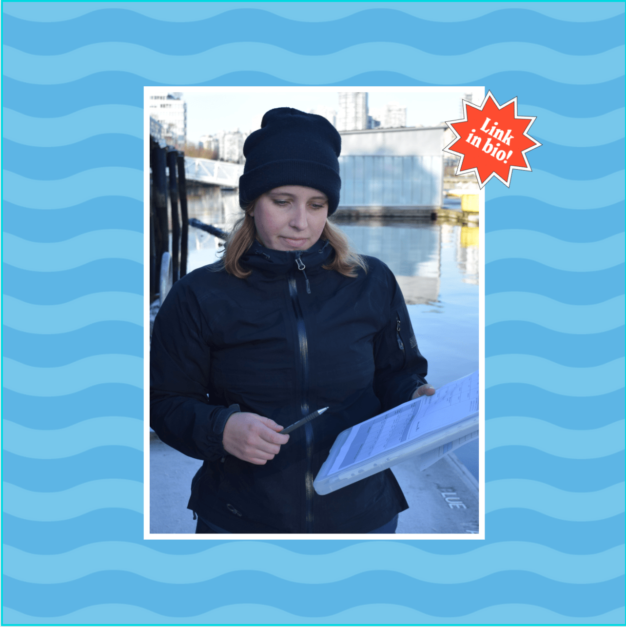
Swim Drink Fish
I created a variety of social templates for Swim Drink Fish, meant to adhere to their brand guidelines while being engaging and cohesive on Instagram. Designing fun stickers to add as simple .png’s into each Canva template was a foolproof way to personalize things.


brand identity
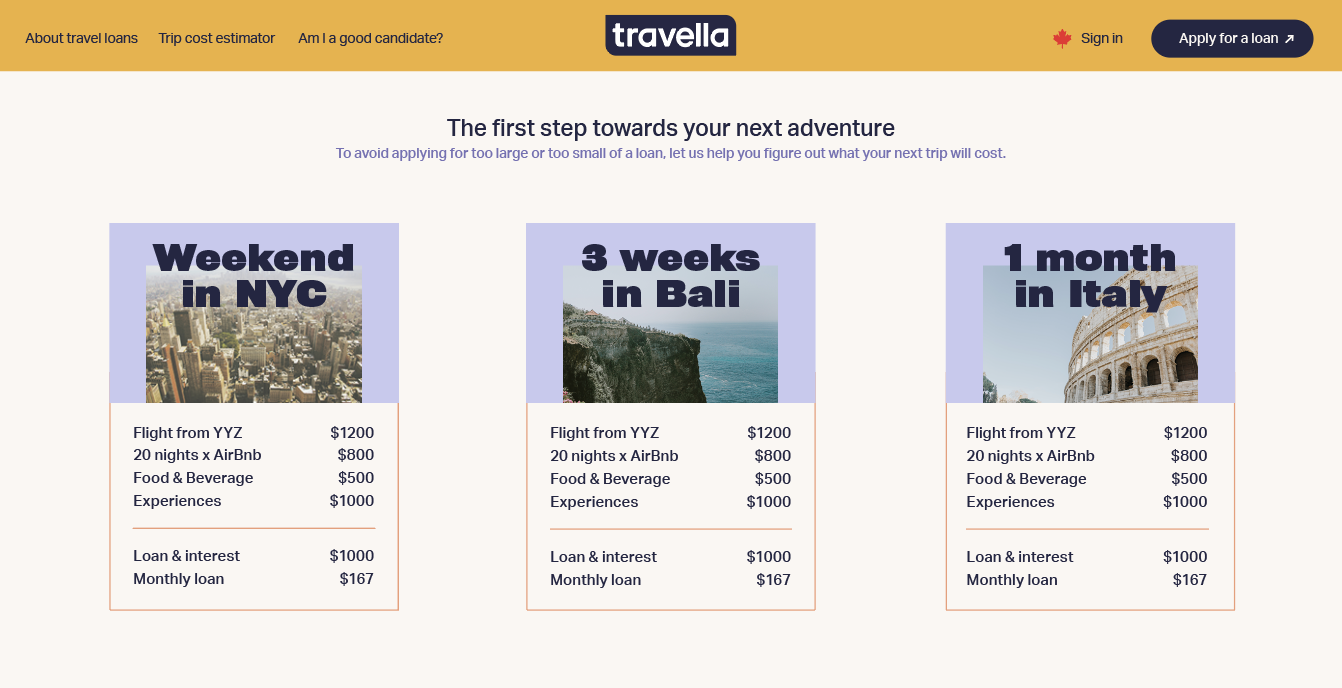
Travella
I designed this brand identity for millennial-focused travel loans app, Travella. The trustworthy team of navy blue and muted orange are a contemporary twist on a classic choice among travel lending companies. This design balances design elements that older users can identify with while appealing to Travella's primary demographic. Expressing dialogue and communication builds trust and engages users even before they're able to interact with the system.


brand identity
Abode Real Estate Group
I was approached to create a brand identity to convey a polished, professional look for a growing real estate firm based in Vancouver. We went with a geometric, minimal look and carried the logo throughout to make a herringbone pattern, used as a supplementary graphic.


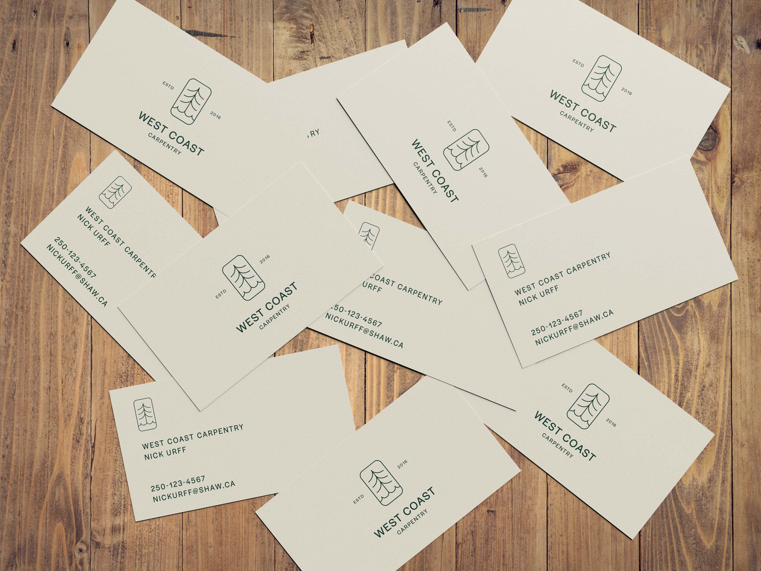
logo
West Coast Carpentry
While I typically don’t take on logo-only work anymore, here’s an example of a logo for a west-coast based carpentry business who needed a logo for shirts, hats, and van decals. Their goals were to evoke simplicity, quality, and care for the environment.